Fifteen years building brands as worlds of their own, carried from first idea to
something people can hold, buy, or walk through. Most of that work ships into
regulated shelf space, where the label has to clear the state before it ever has
to sell.
Physicalmade and printed in house, photographed as it existsArtworkvector, illustration or production fileMotiona moving image; it plays on the pageRenderAI-composited render, or a 3D product mockup, not a physical object; label and mark artwork drawn in Illustrator
Plate 01
Packaging & Identity
Str8CBD
A legacy THC brand repositioned into CBD and carried all the way through to retail:
identity, label system, e-commerce, and the merchandise that travels with an order.
Engagement
Partner in the brand
Role
Brand design, art direction, production files
Scope
Identity, packaging, e-commerce, merch
Production
Files prepped for vendor press; labeling and merch pressing in house
The brand already had equity under THC. Moving it into CBD meant a different category,
a different buyer, and a different set of rules governing what the panel is allowed to
say. I kept the roundel and the name doing the recognition work, then rebuilt everything
around them to hold a compliance panel without reading like a warning label.
Labels print on holographic stock so the bottles catch light on a crowded shelf, where
a matte white competitor disappears. The artwork is layered vector built in Illustrator
with spot separations and CMYK builds for the label press, and the color bands carry SKU
identity so a customer can tell full spectrum from no-THC across the room. Every bottle and
jar in the line was labeled by hand, which is also where the tolerances got settled: a
label that wraps a curved bottle without a seam gap has to be proofed on the bottle
rather than on a flat.
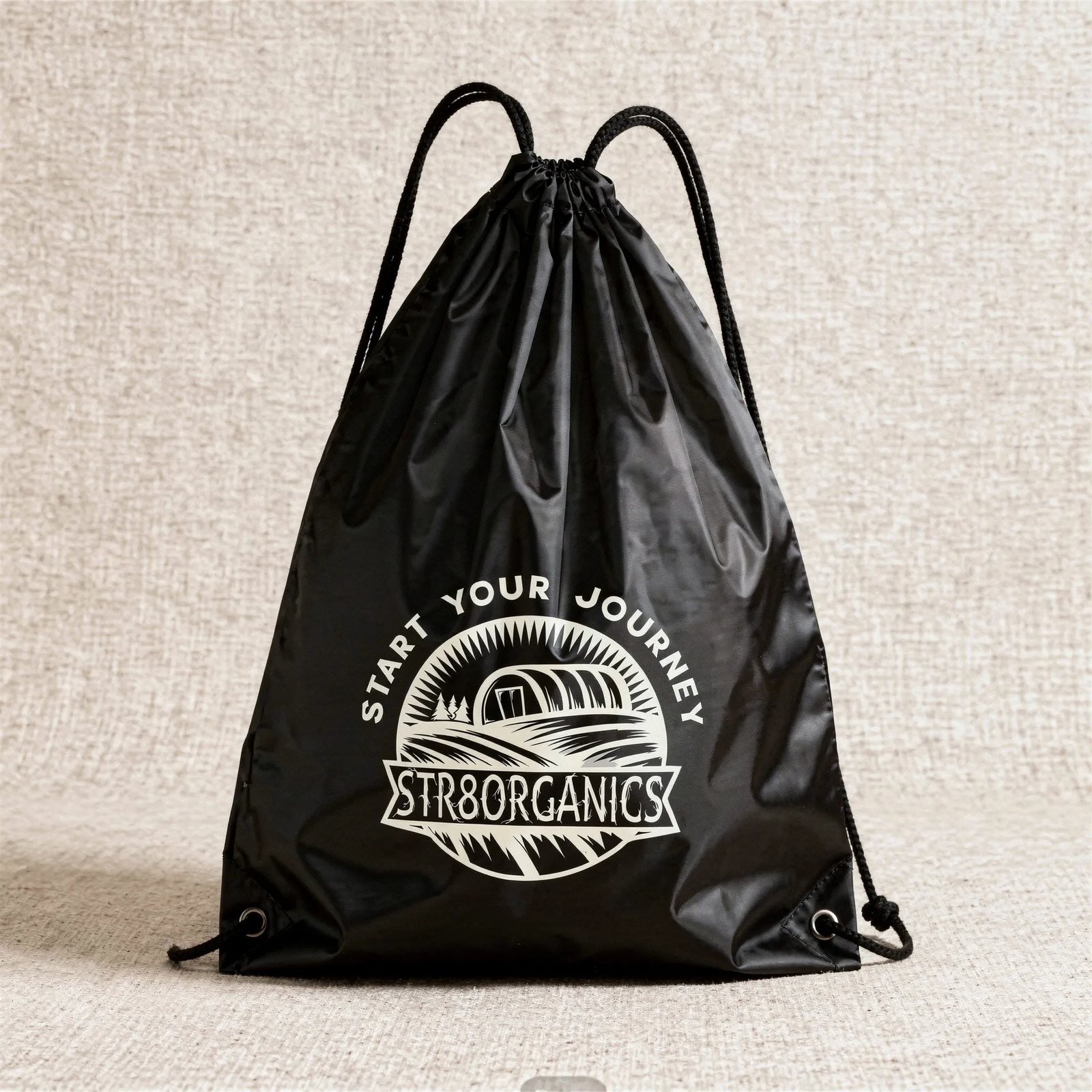
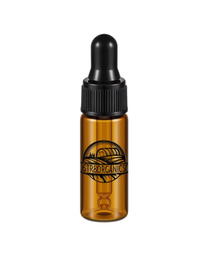
The merchandise was a lever, not a giveaway. A spend threshold released a branded cinch
bag and a mini tincture, which lifted order value and put the brand into circulation
outside the house at the same time.
Vendor printed, applied in houseFig. 1 · Off the line
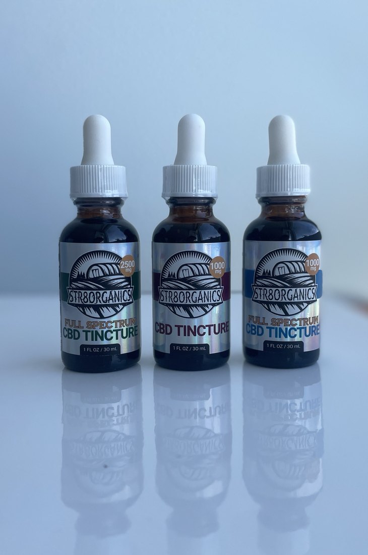
1000 mg CBD Tincture, no THC, 1 FL OZ / 30 mL. Label pressed onto
the bottle by hand. Shot moving in daylight because holographic stock only does its job
in motion: the finish shifts as the bottle turns, which is the entire reason for
specifying it over matte.
Press-ready artworkFig. 2 · Label system, tinctures
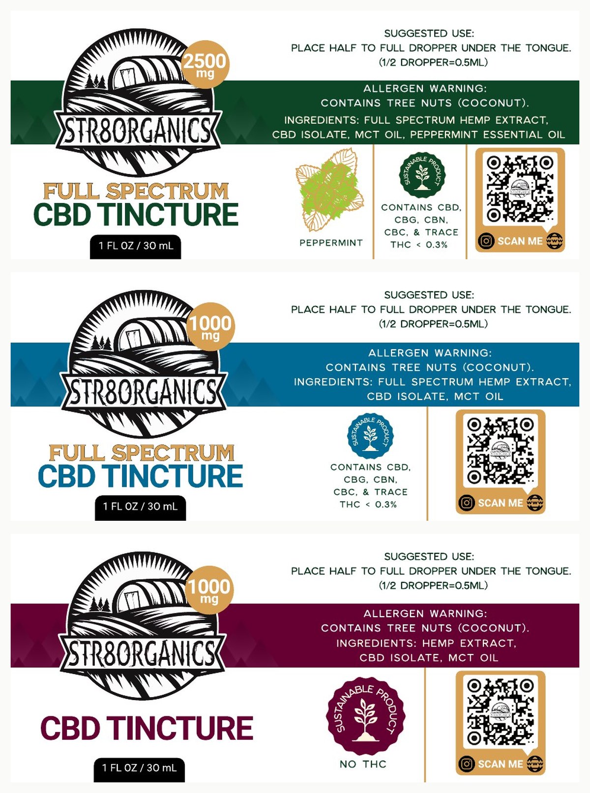
Three SKUs on one grid. Band color carries the variant: green 2500 mg full spectrum
peppermint, blue 1000 mg full spectrum, burgundy 1000 mg no THC. Every panel
holds suggested use, tree-nut allergy warning, full ingredient list, the sustainable
product seal, and a QR to the site.
Applied by hand in houseFig. 3 · The same three, filled
Artwork on one side, product on the other. Band colour does the sorting from across
a room, long before anyone is close enough to read a milligram figure.
Press-ready artworkFig. 4 · Label system, topicals
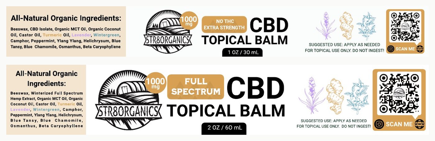
Wrap flats at 1 OZ / 30 mL and 2 OZ / 60 mL. The same architecture
scales across two label widths: ingredient panel left, mark and claim center, botanical
key and QR right. Lavender, turmeric, and wintergreen drawn as line illustrations so
the actives are legible before anyone reads the list. Applied to every jar by hand,
same as the tinctures.
AI-composited renderFig. 5 · Topical, styled
The jar staged with its own actives. Botanicals on the label and botanicals in the
shot run the same palette, so the product photography extends the identity instead
of competing with it. Dark ground chosen to let the holographic finish do the work.
AI-composited render; label artwork drawn in Illustrator.AI-composited renderFig. 6 · Topical, in use
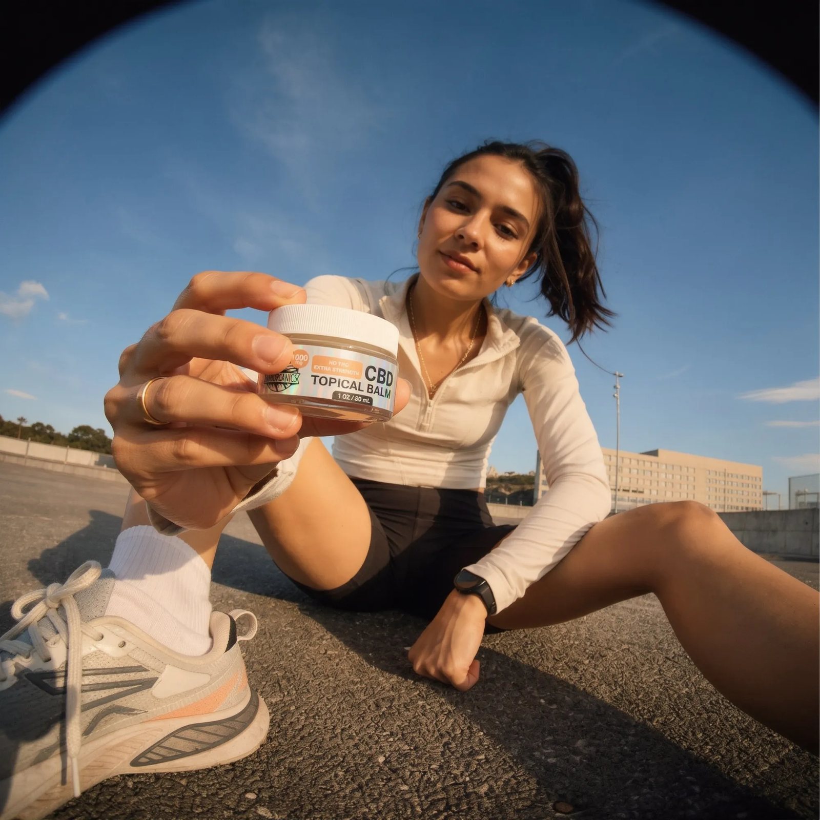
The balm opened where it gets used, after the run rather than on a shelf. Shot wide
and low so the jar stays legible at thumbnail size in feed.
AI-composited render; label artwork drawn in Illustrator.
AI-composited renderFig. 7 · Threshold reward
The cinch bag released at the spend threshold, carrying the roundel with
“Start Your Journey” arced above it. Mark sized to read at arm's length
so the bag keeps working once it leaves the house. Shown as a render; the bags
themselves were heat pressed in house.
AI-composited render.MockupFig. 8 · The other half of it
The mini tincture that shipped with the bag. At this size the roundel runs alone:
no band, no claim line, no dosage, because the bottle has room for a mark and
nothing else. UV printed and applied by hand in house.
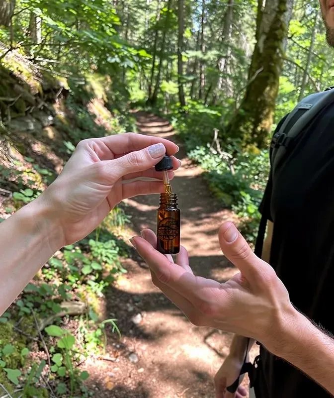
AI-composited renderFig. 9 · Use context
Campaign direction: the product handed off mid-trail rather than staged on a counter.
Sets the occasion the brand is asking to be bought for.
AI-composited render.
Plate 02
Identity & Campaign
Real California
Cannabis clones and apparel under one identity, carried from the grow room into the
handout, the merch, and a strain teaser for every drop.
The mark had two jobs that usually pull against each other. It sits on a living plant a
grower keeps for a season, and it sits on a garment someone wears in public. A roundel
does both: leaf over sunrise arcs, furrowed rows beneath, heavy enough to survive a
holographic sticker and quiet enough to live on a plant without shouting.
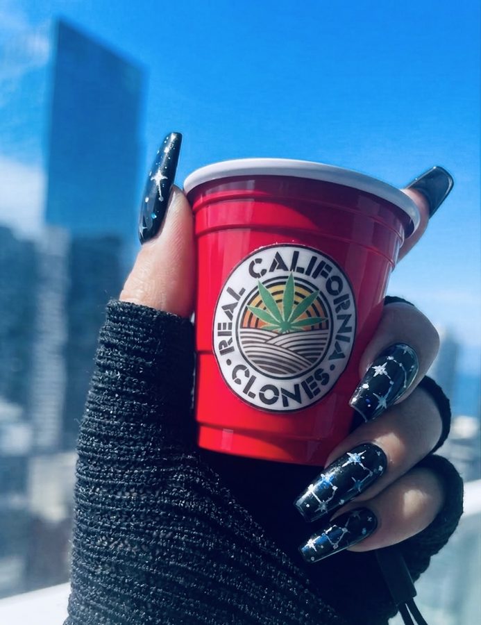
A clone ships in a red cup. Rather than design around that, I made the cup the brand
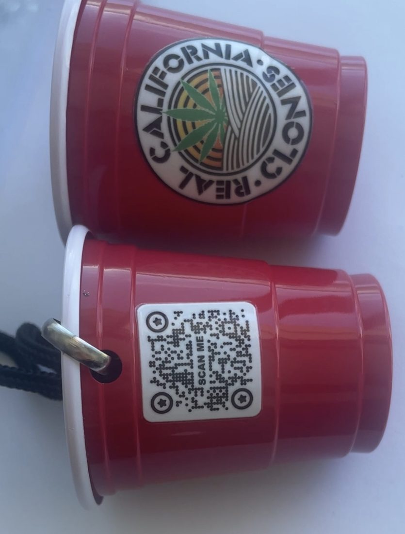
device. Printed mini cups on lanyards replaced paper flyers, roundel on one face and a
QR on the other. A paper flyer gets folded into a pocket and thrown out; a cup on a cord
goes onto a keyring and stays on the counter, and it is still a working flyer the moment
someone scans it.
The QR opens the site. The strain list is its own piece, reissued every week inside a
cash register receipt: monospace, rule lines, barcode, torn edge. Availability and
pricing move constantly in this category, so the format had to be one I could reset
weekly without it reading as a new design each time.
Nothing on this brand went out to a vendor. On Str8CBD I prepped files for a vendor's
press and applied every label myself, which is where I learned what that press was doing
to my artwork. Real California is the same job brought in house: I print it, cut it, and
apply it.
Every drop gets a vertical teaser that puts the cross in the same position each time.
That notation is breeder shorthand, so the parentheses carry real information to a
grower and read as a subtitle to everyone else. I art-direct and produce all of them,
and the mix is deliberate: my own illustration carries the scene, Adobe Firefly fills in
generated elements, product photography grounds it, Adobe Express handles the animation,
and the pieces are scored with custom beats made in house. The teens introduction is the one
exception: that one runs on a stock track.
A · The device
MotionFig. 10 · The mark, moving
The roundel with the plant growing up through the centre of the field. The mark was
drawn around a centre axis, which is what lets it animate from the inside instead of
fading in as a flat stamp.
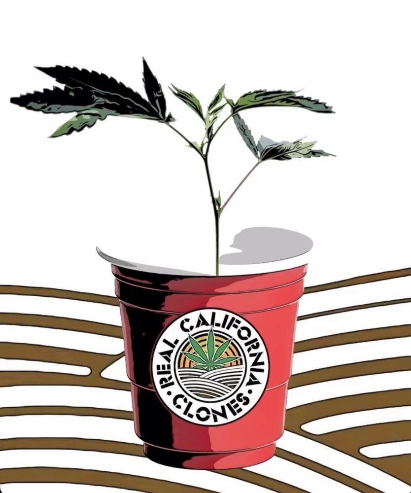
Original illustrationFig. 11 · Drawn first
A rooted cutting in a branded cup, dome tilted off, drawn because
a photograph of a seedling reads as any seedling. The artwork comes first and the
merchandise follows it: this is the cup that gets printed.
UV printed in houseFig. 12 · The handout
The same cup, printed and carried. Sized for a keyring rather
than a pocket, which is the whole argument for it. Labels UV printed in house and applied by hand across a
run of 100.
UV printed in houseFig. 13 · Two faces
Roundel on one side, QR on the other, grommet and cord through the rim. The entire
handout is two printed faces and a length of cord.
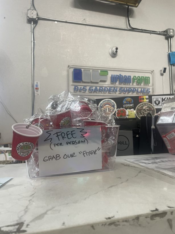
In retailFig. 14 · Counter placement
The bin on a garden supply counter. The quotation marks in the handwritten sign are
the tell: staff end up explaining the object themselves, which is the handout doing
work a flyer cannot.
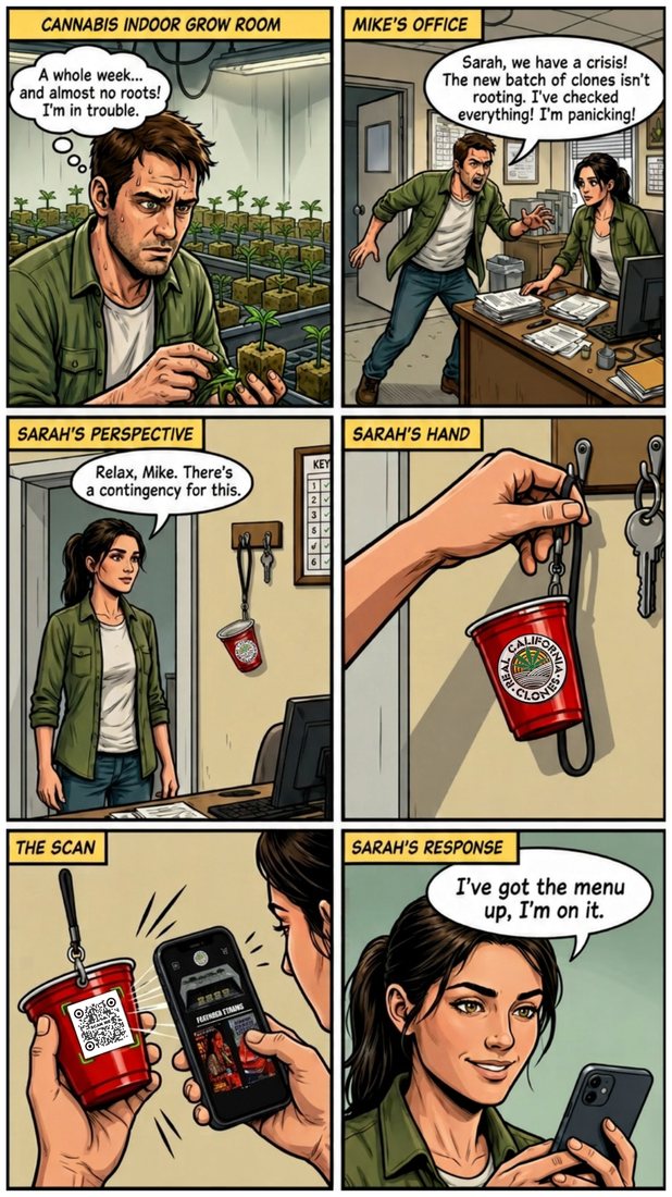
Campaign artworkFig. 15 · The scenario, drawn
Six panels running the exact situation the handout was built for: a batch that
failed to root, the cup already hanging on the key hook, a scan, the menu open.
MotionFig. 16 · The weekly menu
Current strain list, reissued every week. Built as a template: the receipt furniture,
the terms and the footer stay fixed, and only the strain lines and prices change, so a
new week is a data edit rather than a new design. Animated for feed rather than posted
as a flat.
MotionFig. 17 · Weekly drop card
What goes out when the menu changes. The same weekly cadence as the receipt, animated
for feed, with the clone in the branded cup doing the job a product photo would.
MotionFig. 18 · New drop, coming
The announcement that runs ahead of a release. A barber shop because grooming means
the same thing in both rooms: a plant gets cleaned up before it flips to bloom, and the
cuttings taken off it are the clones being sold. Any cultivator reads that in one beat,
and nobody outside the room needs it explained.
MotionFig. 19 · Teens, introduced
Clones have an older sibling, sold in the same cup a size up. The introduction had to
make a second category legible without inventing a second identity, so it stays the
same cup and the same roundel with one word added across the base.
Stock track rather than an original score.
MotionWild Cherry( LCG BX1 )MotionToad Venom( Animal Face × Sin Mintz )MotionBlu's Qlues( Blue Cookies × Project 4516 )MotionPineapple MambazClone Station vending scene
Seven drops on one grid. The name holds a consistent position, the cross sits in
parentheses where there is one, and the roundel enters each scene as an object rather
than being stamped on top: an air freshener on a mirror, a patch on a work shirt, a
pile of stickers on a desk, a header on a vending machine.
Each one animates for vertical feed rather than posting flat, and each carries its own
beat, original and made in house.
Original illustration with Adobe Firefly generations and product photography, animated in Adobe Express, scored in house.
C · Extensions
3D printed in houseFig. 20 · Plant stake
Printed on my own machine so the identity reaches the one surface a grower looks at
every day. Disc head sized to the roundel, flat blade for a written strain name, point
tapered to go into a filled cup without disturbing the root ball.
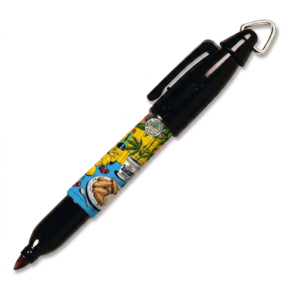
MockupFig. 21 · Marker wrap
Grenadine artwork wrapped on a clip-on mini marker. Growers label trays constantly
and lose markers constantly, so the giveaway is a tool they were going to replace
anyway. Shown as a mockup.
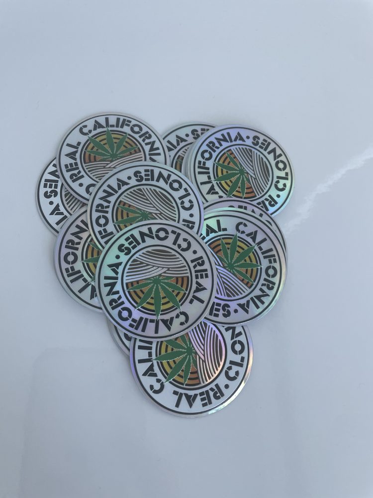
Printed in houseFig. 22 · Holographic run
The roundel cut on holographic stock. Line weights were set heavy enough that the
mark still reads when the substrate is throwing color across it.
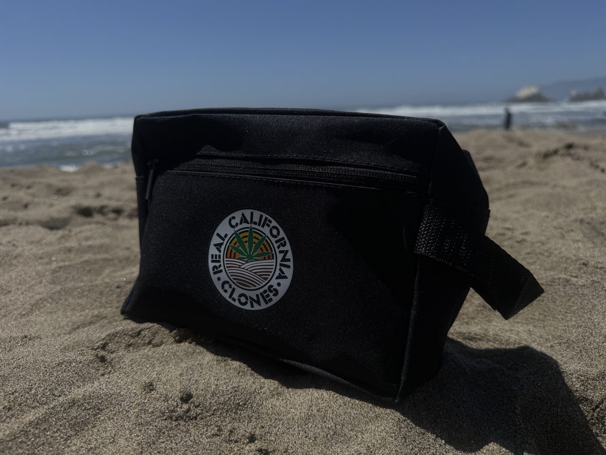
Printed in houseFig. 23 · Zip pouch
The apparel side of the system. One-color roundel on black, which is where the mark
has to work hardest: no sunrise gradient to carry it, just the line work.
Plate 03
Brand & Operations
Midriff & All Things Align
Two apparel brands built and run end to end on one operating package: brand systems,
storefronts, catalogs, merchandising, and fulfillment.
Role
Founder, designer, operator
Scope
Brand systems, Shopify builds, catalog operations, UGC and paid social
Midriff's brand system was built in Figma and extended across Shopify: product line,
storefront assets, merchandising, and an embedded 3D shopping experience. All Things
Align got its own identity and print work on the same foundation.
The operation is the part worth looking at. At five or more new designs a week the catalog
work scales faster than hours do, and the usual answer is to hire the hours. I rebuilt the
layer instead. Claude Code connects directly into the store and standardizes products
across titles, types, tags, meta content, and alt text, with rule-based collections that
keep merchandising consistent as new drops go up.
The second store is the proof the first was not a one-off. I packaged the workflow built
for Midriff and ran it on All Things Align: same connection into Shopify, same
standardization pass, same collection rules, a different brand sitting on top. It began
as a test of the package and shipped anyway, because a system is only proven when it
reaches a live storefront with real products on it rather than stopping at a demo.
The split below is the deliberate part. Every decision that sets taste or spends money
stays with me; the repetitive layer runs on its own and gets reviewed, not trusted.
Who runs what, on both stores
Stage
Runs on
Product and graphic design, 5+ a week
Me
Line direction and merchandising calls
Me
Catalog standardization: titles, types, tags, meta content, alt text
Claude Code, into the store
Collection assignment as new products publish
Rule-based, automatic
SEO copy
AI, reviewed
UGC content and paid social: audiences, budgets, creative versions
Me
Reading performance and changing the spend
Me
Final review on anything that ships
Me
A · Midriff
Original letteringFig. 24 · Midriff wordmark
Drawn rather than set. A brush script keeps the speed of the drop cadence in the mark
itself, and it holds at chest print size without a typeface license following it onto
every garment.
MotionFig. 25 · The UGC template
One frame, built to be refilled. A yellow header band takes the collection name, the
middle takes whatever footage the drop has, and the base holds a magenta figure and
the store URL in a fixed lockup. Swap the footage and the name and the post is done,
which is what keeps a five-a-week cadence from turning into five design jobs a week.
Shot and cut as UGC so it reads as someone wearing the product rather than an ad,
and run as paid social from the same frames.
B · All Things Align
Original letteringFig. 26 · All Things Align wordmark
Geometric sans with four letters cut to a point: the two A apexes break above the cap
line and the two N strokes drop below the baseline, so the name carries as above, so
below in its own letterforms. Dark navy against Midriff's pink: the two brands run on
the same operating package and deliberately share no visual language.
Print designFig. 27 · Garment print
Three type registers stacked in one lockup: copperplate script, blackletter, and a
condensed gothic reversed out of a solid bar. Each word carries a different voice, and
the bar puts the weight on the last one.
MotionFig. 28 · The print, in film
The campaign piece for that print. The shirt is shot from behind and walking away, so
the lettering is the only thing holding still in the frame and the viewer reads it
rather than the person wearing it.
Plate 04
Identity System
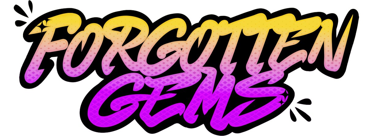
Forgotten Gems
Retro nostalgia apparel: identity, guidelines, garment graphics, and the storefront
they sell from.
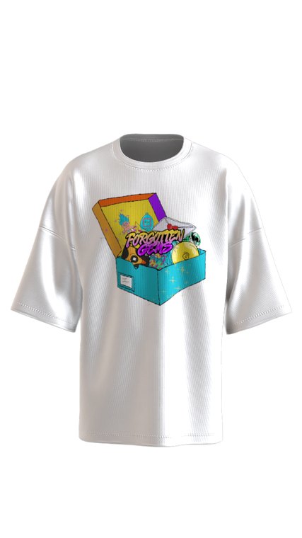
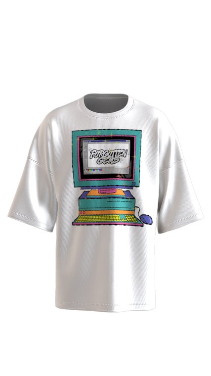
The identity is built on the objects themselves: a blind box caught mid-open, a beige
desktop running a paint program, an arcade cabinet coming apart. Each graphic is a
memory drawn as a product, which means the brand never has to explain itself in a
tagline.
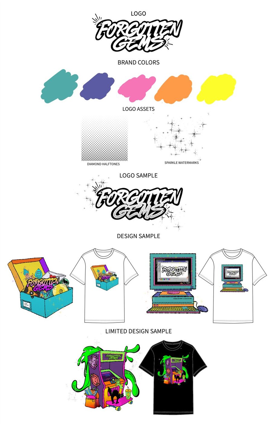
The guidelines name two reusable assets, a diamond halftone and a sparkle watermark.
Every drop inherits the same texture and the same light without anyone redrawing them,
and that is what holds a graphic-led brand together when no two graphics are alike.
The palette is presented as painted swatches rather than chips, in the same register
the logo is drawn in.
The applications move. The mark spins, and the garments carry a walk cycle so a print
reads on a moving body instead of sitting flat on a product page. Stills below.
Brand guidelinesFig. 29 · Identity sheet
The whole system on one page: logo, five-color palette, named logo assets, logo
sample, design samples, and a limited drop. Anyone picking this up can produce the
next graphic without asking me a question.
Original letteringFig. 30 · Wordmark
Brush script on a two-line stack with a heavy outline, the gradient running yellow to
magenta through the halftone. The outline is what lets it sit on a black tee or a
white one without a second version.
MotionFig. 31 · Extruded, spinning
The same lettering built in three dimensions with a chrome and rose gold finish and
animated as a continuous rotation. The mark carries enough stroke weight to survive
extrusion and to stay readable through the turn, which flat lettering usually does
not.
3D garment mockupFig. 32 · Blind box
Built on a 3D garment rather than laid flat, so the print reads across the drape and
the shoulder seam instead of sitting square on a rectangle, which is how it will
actually meet a buyer. The logo sits inside the scene, printed on the open lid,
rather than above it as a signature. Built for the storefront, queued for upload.
3D garment mockupFig. 33 · Desktop
Same 3D build, same rule on the mark: it appears on the monitor, inside the paint
program, as something the scene is making rather than a logo placed on top of it.
MotionFig. 34 · Limited drop, moving
The limited graphic on black: an arcade cabinet coming apart in green slime, the
logo lit on the marquee. Built as a walk cycle so a product page shows the print
moving on a body rather than lying flat.
Plate 05
Series Art Direction
Lowrider Stories
A cover system for Stockton’s Finest Apparel, built to run volume after volume
with a different city each time.
Engagement
Contract
Client
Stockton’s Finest Apparel
Role
Series art direction, cover design, production, website
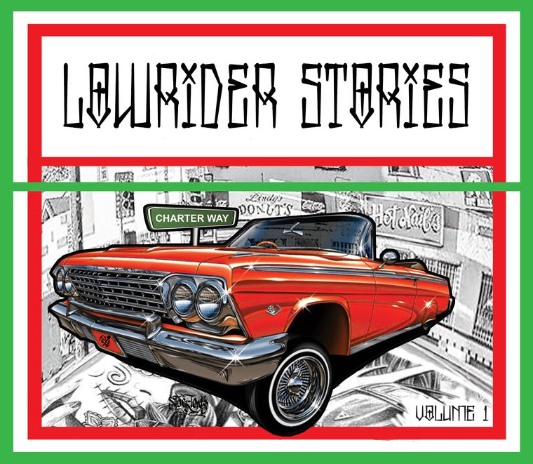
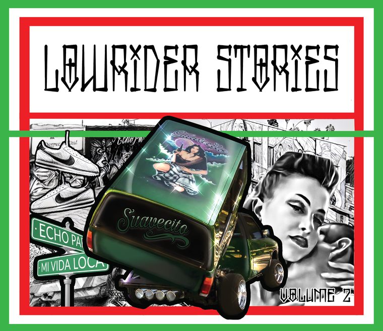
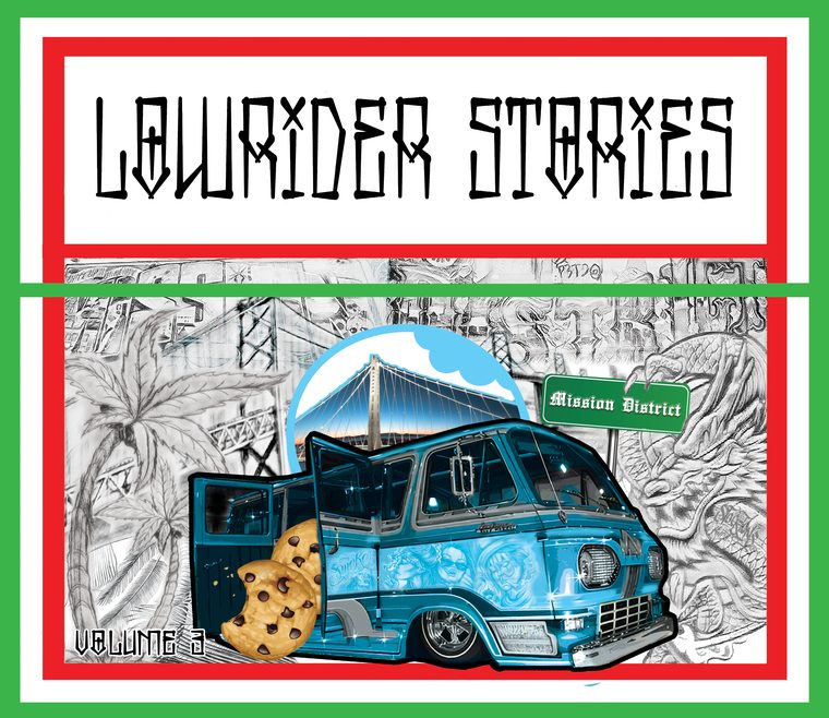
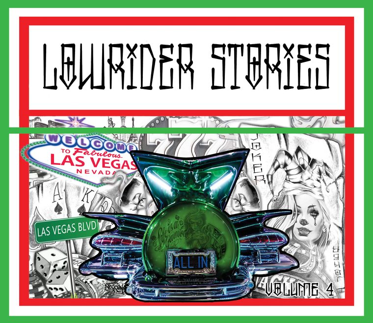
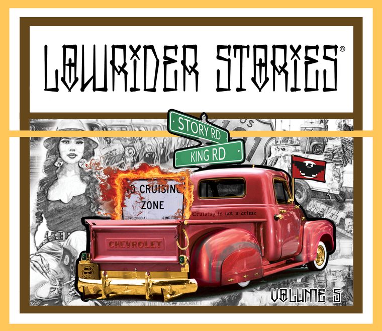
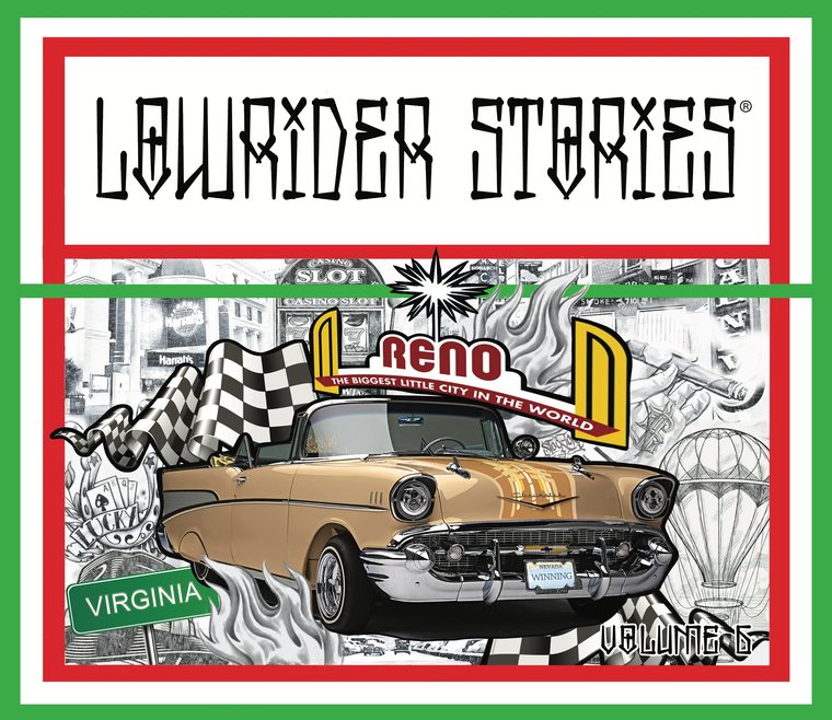
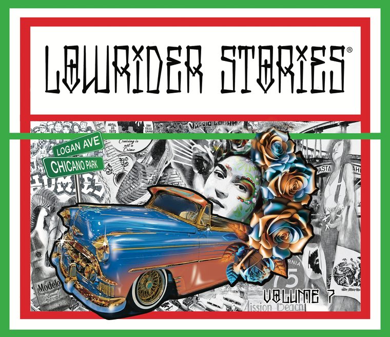
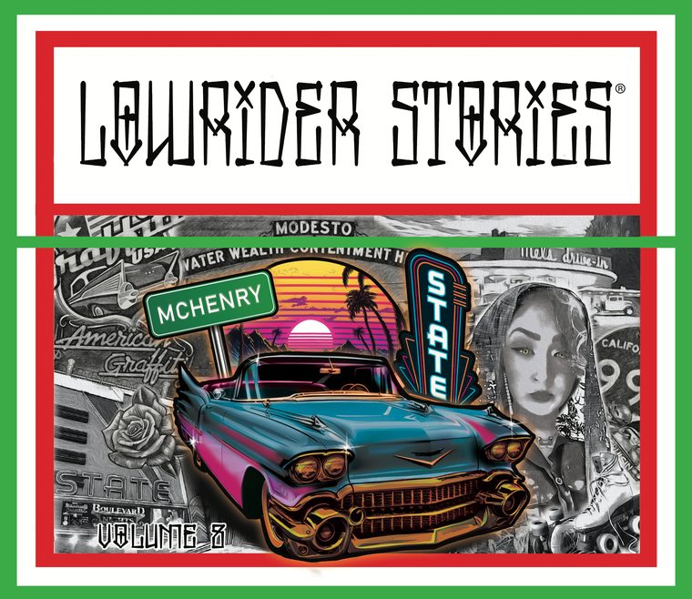
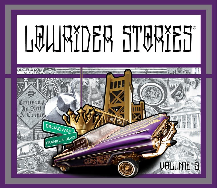
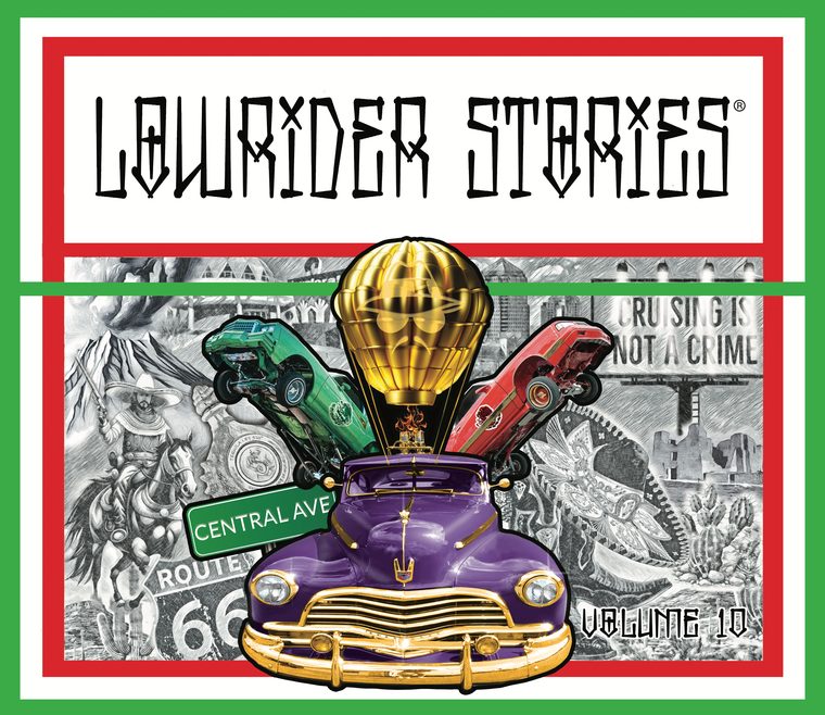
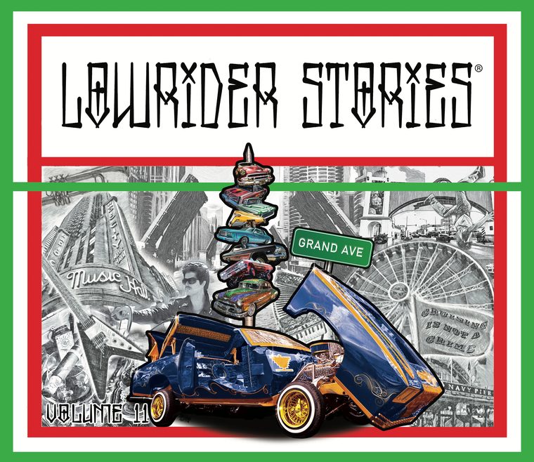
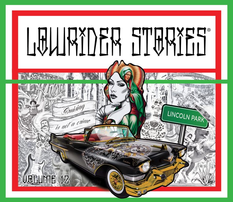
Every volume takes one city. The car changes, the street signs change, the landmarks
behind them change, and nothing else does. Charter Way in Stockton, Echo Park, the
Mission, Chicano Park, Story and King in San Jose, McHenry in Modesto, Broadway and
Franklin in Sacramento, Central Avenue on Route 66, Grand Avenue in Chicago, Lincoln
Park.
The frame does the holding. Masthead locked in a white box across the top, a red, white
and green border, and a rule that breaks out of the frame and runs the full width.
Inside it, the hero car sits in full colour behind a heavy keyline, over a collage of
local landmarks rendered down to pencil. The car is the subject and the city is the
ground, every time, which is what lets a reader pick the series out of a rack and still
know which volume they are holding.
The series came with a site as well. It is no longer hosted, which is the usual fate of
a small brand's website once the renewal lapses, so the covers are what remains to show.
Two volumes break the border colour deliberately: brown and gold for San Jose, purple
and grey for Sacramento.
Twelve volumes, one chassis
Volume 1Charter Way, StocktonVolume 2Echo Park, Los AngelesVolume 3Mission District, San FranciscoVolume 4Las Vegas BoulevardVolume 5Story Road and King Road, San JoseVolume 6Virginia Street, RenoVolume 7Logan Avenue and Chicano Park, San DiegoVolume 8McHenry Avenue, ModestoVolume 9Broadway and Franklin, SacramentoVolume 10Central Avenue and Route 66Volume 11Grand Avenue, ChicagoVolume 12Lincoln Park
Plate 06
Information Design & Web
Havian Resources
Every customer-facing asset for a 10,000+ SKU commissary and gift-shop line serving
people in custody and their families: identity, catalogue, mail-order form, services
sheet, and the website.
Engagement
In house, as COO
Role
Identity, catalogue, information design, web
Scope
Mark, print catalogue, order form, services sheet, responsive site
Reach
New York and New Jersey to multi-state within the first year
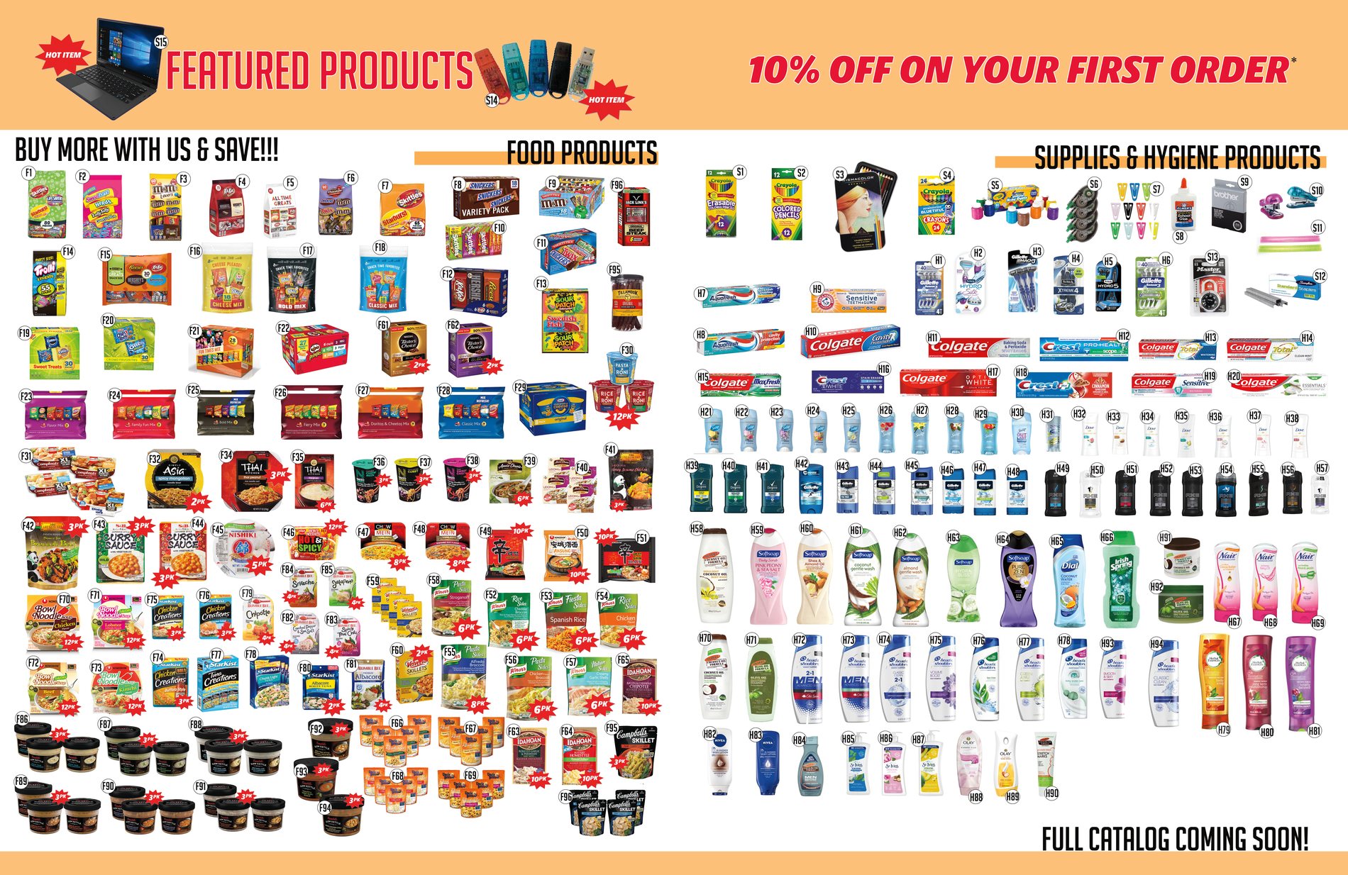
The customer here cannot shop online. Orders are placed on paper, by hand, usually by a
family member, and mailed to a facility. That single constraint set the whole design:
every product in the catalogue carries a code, every code has a row on the order form,
and every row ends in three empty boxes to write in.
The codes carry their category, so F is food, S is supplies, H is hygiene. Someone can
find a shampoo in the picture spread, read H73 off it, and go straight to that line
without scanning two hundred rows of text. The visual page and the order page are two
views of the same index.
Field labels run in both languages throughout, down to the totals: quantity and cantidad,
weight and peso, price and precio, sales tax and impuestos, freight and envío.
The address block asks for housing number and facility alongside name and city, because
that is what the envelope needs to clear.
Print catalogueFig. 35 · Order form and services
Two hundred-odd lines on one spread, each ending in boxes for quantity, weight and
price, with the mailing block set into the foot of the page. Facing it, the mark and a
services list priced per item, from e-stamps to book publishing.
Print catalogueFig. 36 · The picture index
Several hundred products cut out and grouped into food on the left, supplies and
hygiene on the right, every one tagged with the code that matches its row on the order
form. Multi-pack items carry a burst so the quantity reads before the price does.
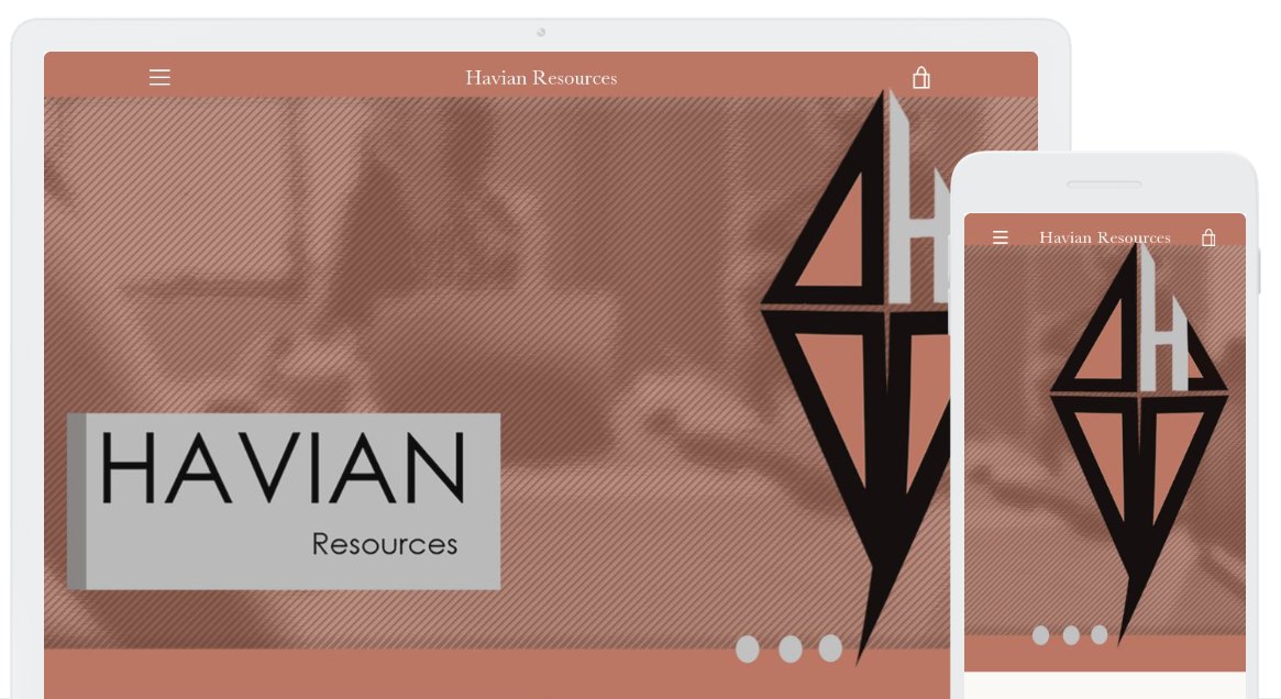
Responsive webFig. 37 · Online, for the people ordering
The same identity carried to the web for the family placing the order, built
responsive because most of them arrive on a phone. The mark is a kite with its tail still
attached and the H built into the sail: it flies, and it is tethered, which is the
condition of the people this catalogue is for.
Plate 07
Practice & Interactive
The Neighborhood Artist
The independent practice most of the client work in this book ran through, and the two
things it is building now.
Fifteen years, three to five accounts running at once, each one owned from brief through
final production file. Storefront wraps, storefronts of the other kind, business cards,
direct mail, and brand kits, mostly for businesses on Stockton streets. The plates before
this are what the practice looks like at full scope; what follows is its range. The
earliest pieces here predate the practice: they were made in house at the two auto
companies where I worked, while my title on the door said accounting. Simmer is the
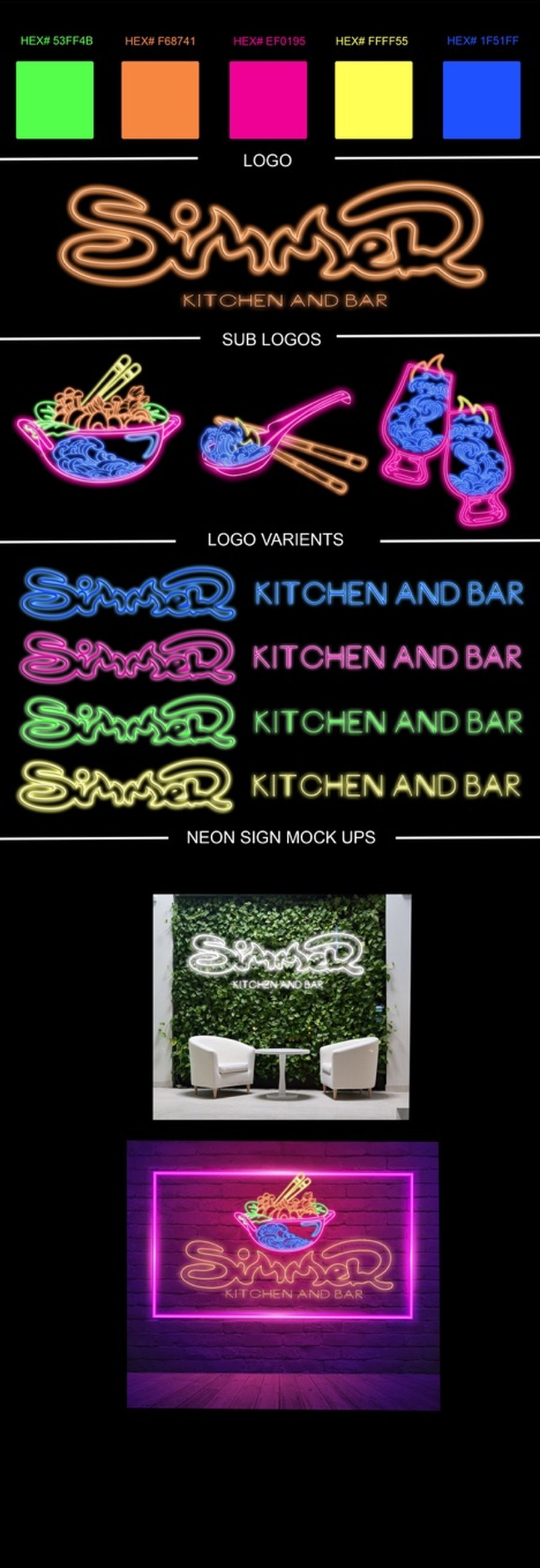
oddest brief in the set: a restaurant through the day and a club at night, so the
identity had to hold under two completely different lighting conditions.
The homepage is not a portfolio. It is a drawing pad. The copy says where I am rather
than what I do, and the only thing to do on the page is leave a mark: scribble with a
finger, a stylus or a mouse, sign it, send it, and it arrives on my desk. A visitor who
came to look leaves having made something instead.
The District is the portfolio, built as a place rather than a page. Neon Alley is the
first street. Storefronts are enterable, a guide named June moves a visitor between them,
and what she says is a door policy rather than a menu: the door will not open for
strangers. Still in development, shown here as it stands.
A · Storefront, at scale
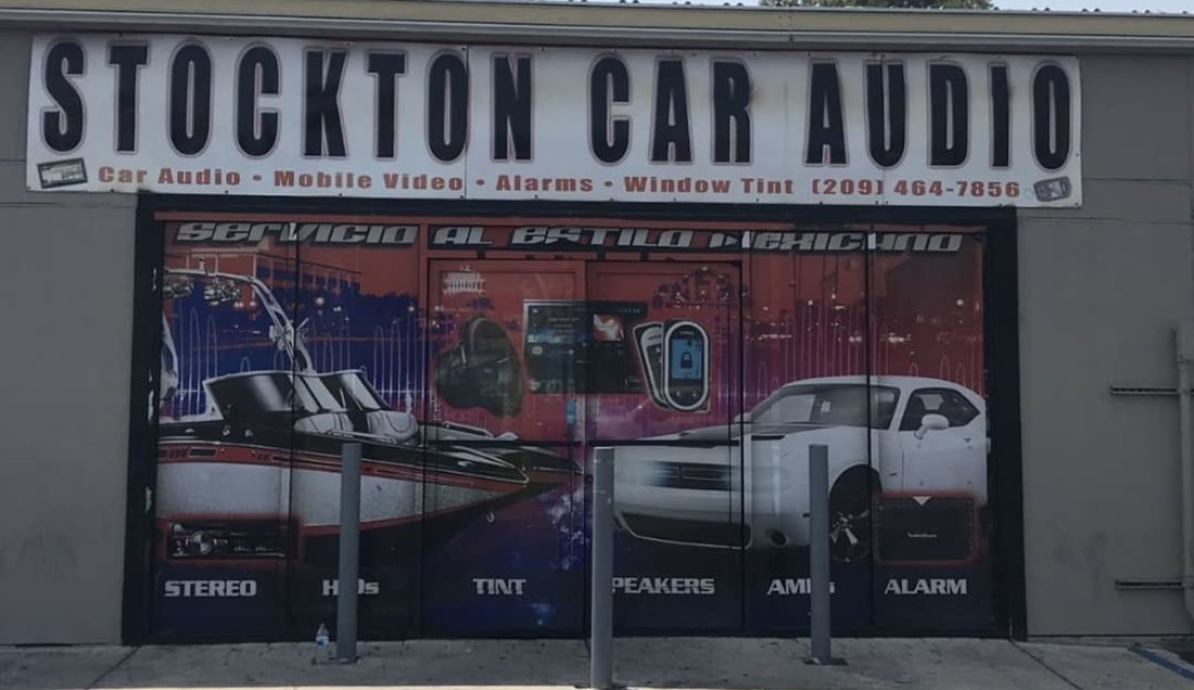
InstalledFig. 38 · Before
The wrap that was there. The ground is doing the shouting: a saturated field that
comes forward and pulls the cars and the gear back into it, so the things being sold
are the hardest things to see.
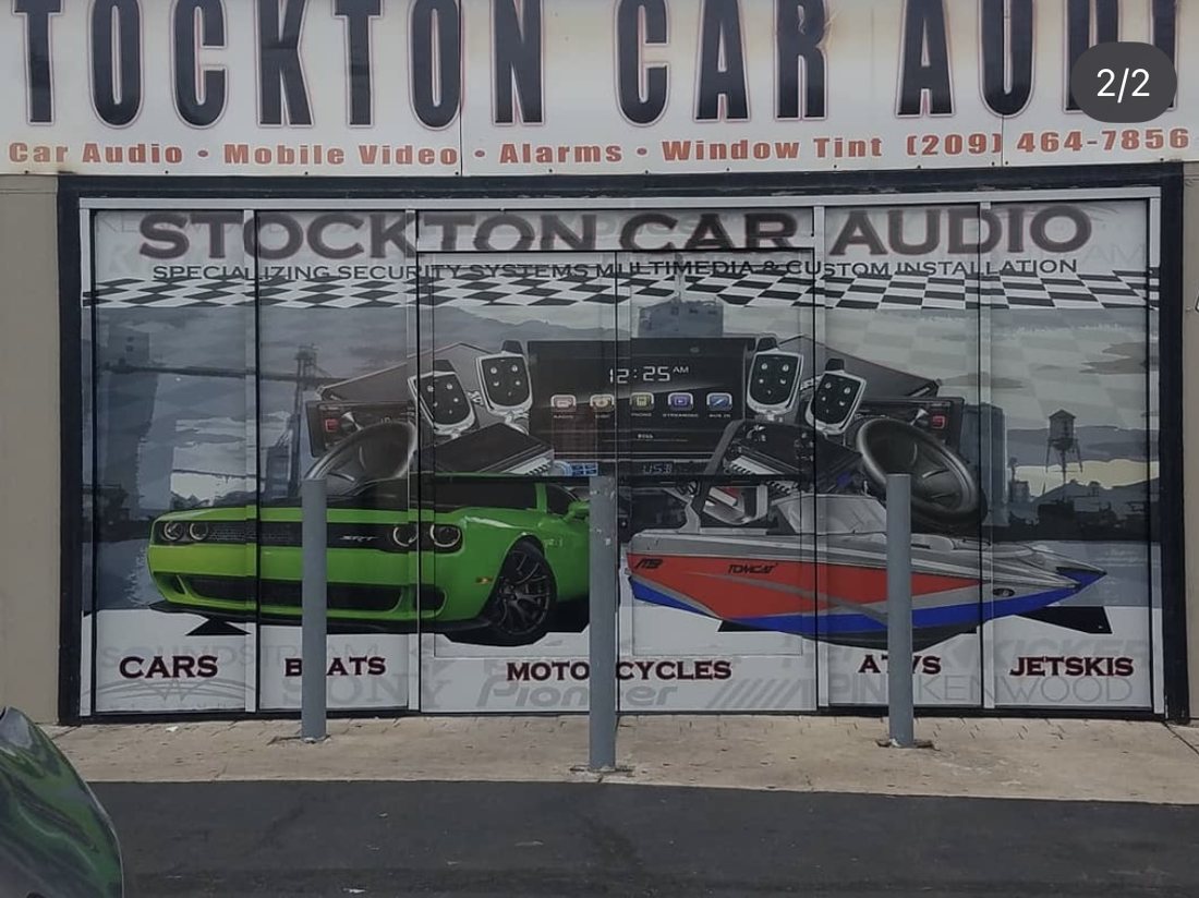
InstalledFig. 39 · After
Installed across six panels. The owner wanted the style kept, so I worked inside it
rather than argue with it; the problem was never the style, it was figure and ground.
Dropping the background to a pale waterfront puts the vehicles and the head units on
top of it instead of in it. The categories then run along the base, cars through
jetskis, which is the commercial argument and the last thing a passing driver reads.
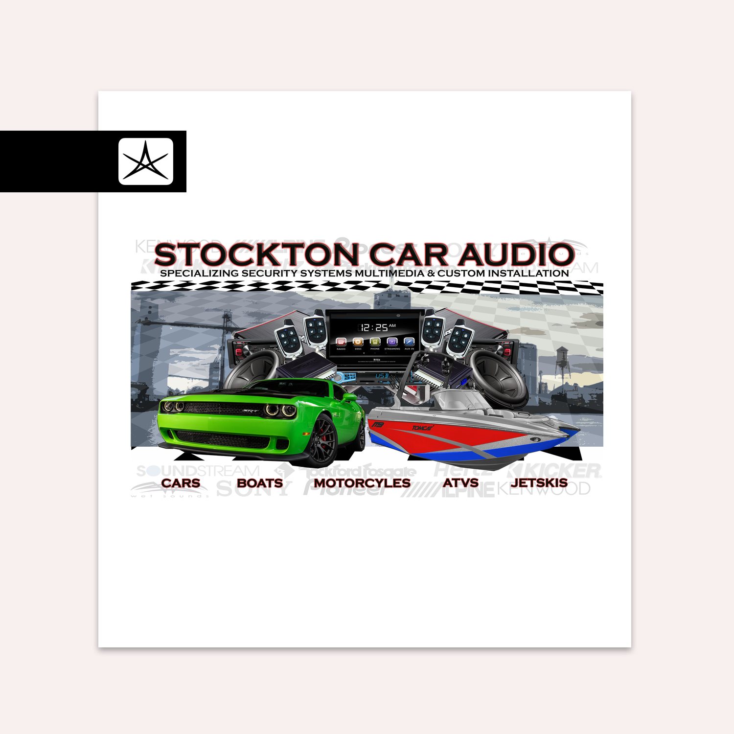
Large-format artworkFig. 40 · The file behind it
Built flat at wrap scale. The waterfront is Stockton's, so the shop reads as local
rather than stock, and it is held back far enough to stay a backdrop. The audio brands
the shop stocks run as a faint band behind the category line: credentials that register
without competing for the front.
B · Web
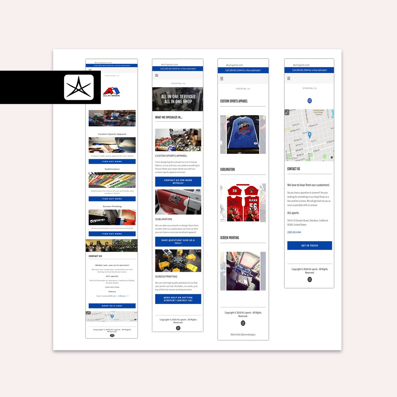
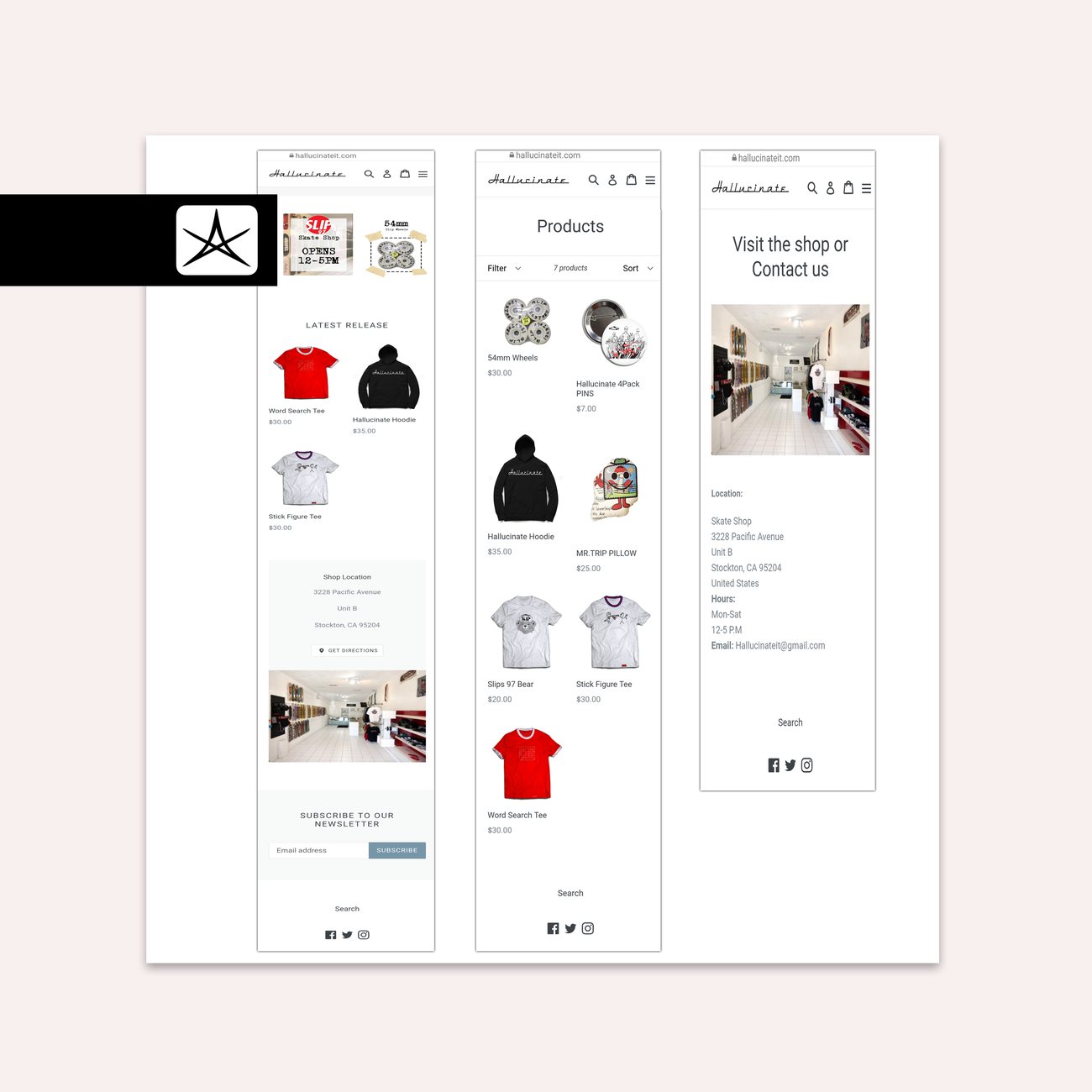
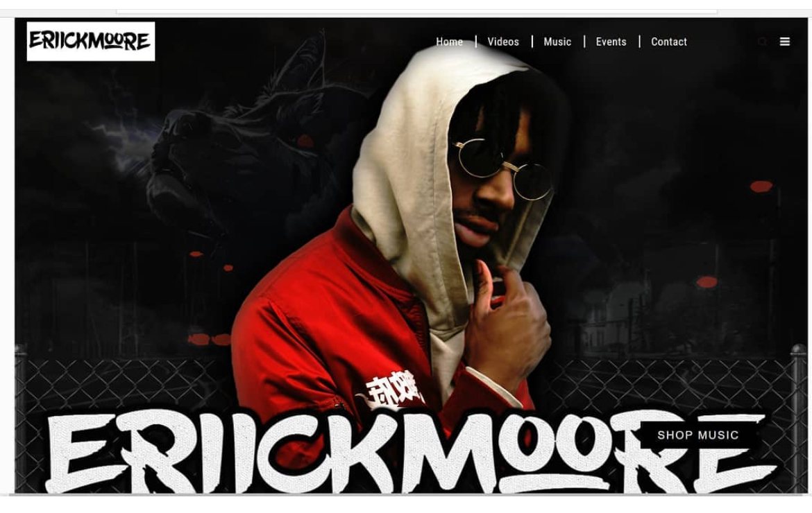
Ai1 SportsCustom sports apparel, StocktonHallucinateSkate shop and apparelErick MooreRecording artist
C · In house, earlier roles
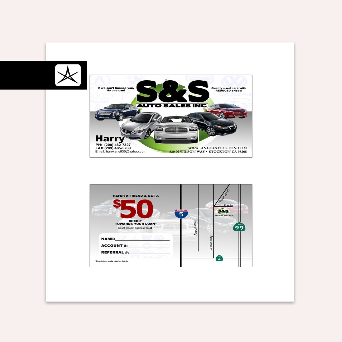
In house · S&S Auto SalesFig. 41 · Card and referral
The reverse is not decoration. A drawn route map off Interstate 5, 99 and 4 puts
the lot in a driver's head, and the referral credit carries blank fields for name,
account and referral number so the card can be processed when it comes back.
Produced in house, 2010–2015, alongside the accounting desk.
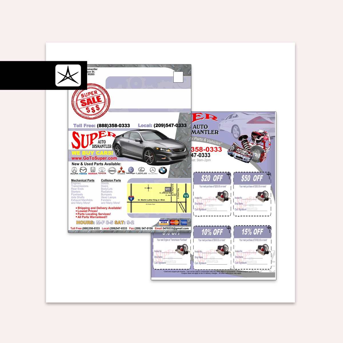
In house · Super Auto DismantlerFig. 42 · Mailer and coupon sheet
A self-mailer with the address panel built into the layout, and six tiered coupons
scaled to spend. Each one carries invoice number, shop name and a signature line, so
the sheet survives contact with an actual counter. Produced in house, 2006–2008,
while the job title said AP/AR clerk.
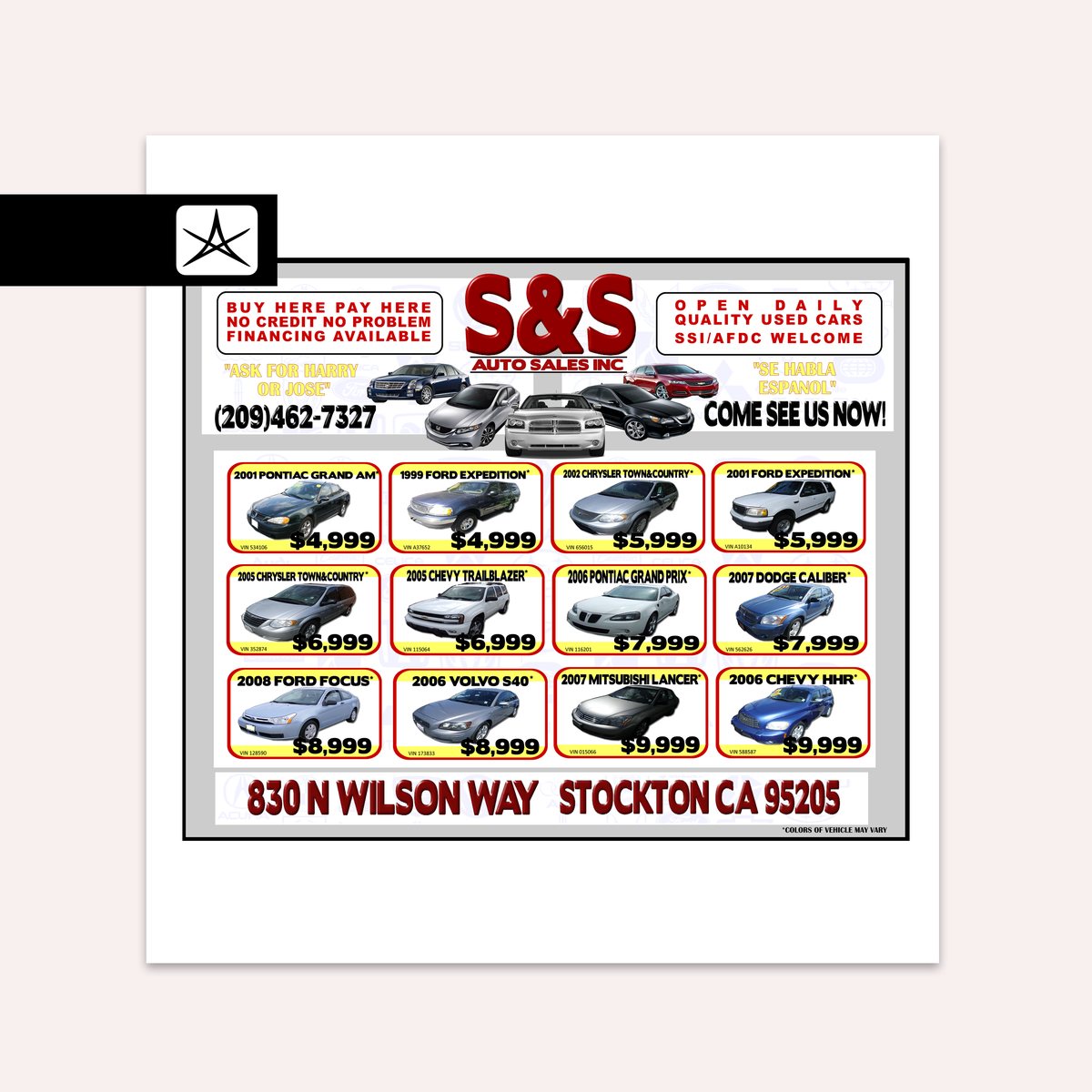
In house · S&S Auto SalesFig. 43 · Inventory flyer
Twelve vehicles on one sheet, each with year, model, VIN and price in the same
position, sorted cheapest first so a buyer reads up to what they can afford rather
than down from what they cannot. Financing terms sit in both languages above the grid.
D · Brand kits
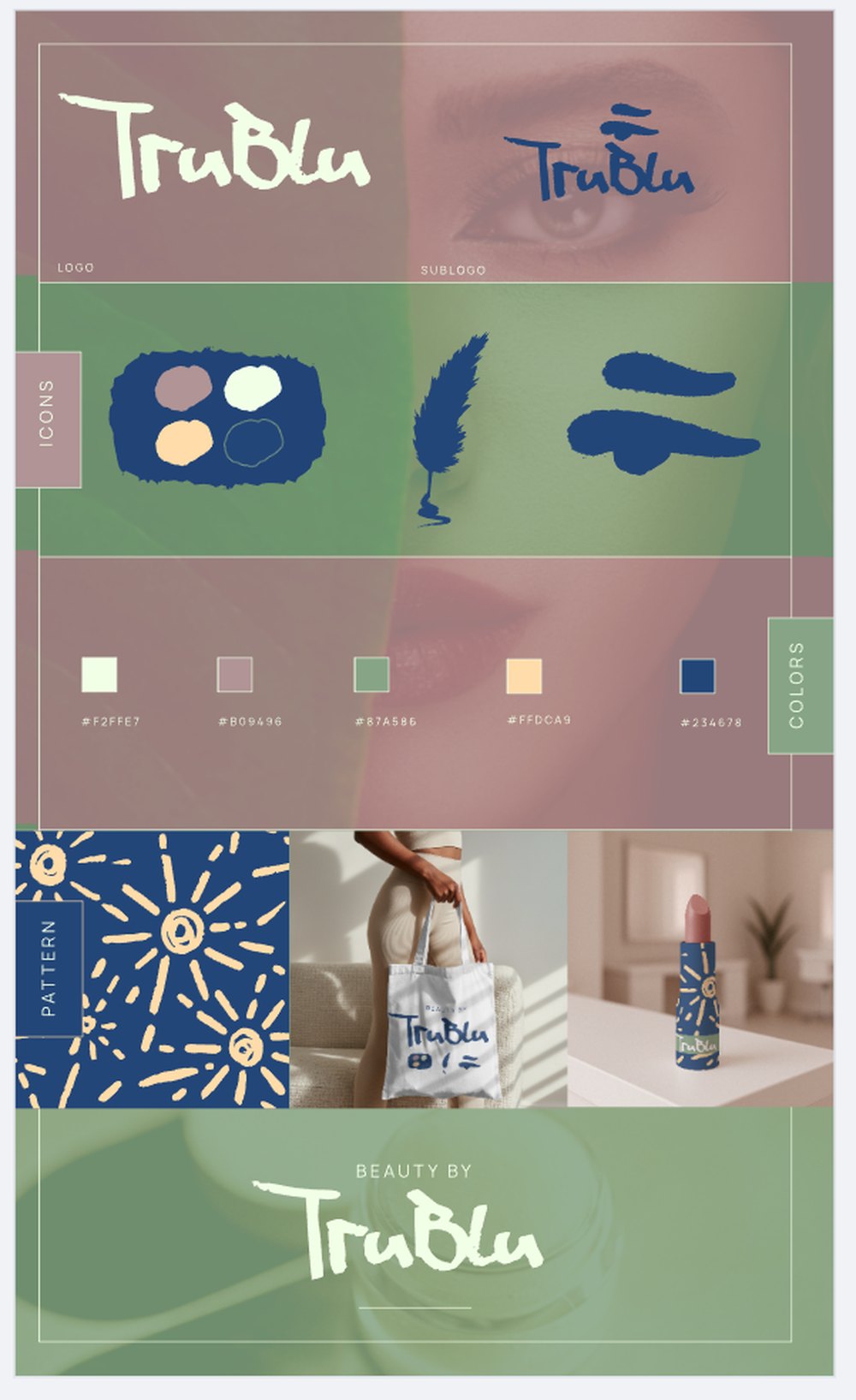
Brand kitFig. 44 · TruBlu
A beauty brand on one sheet: logo and sublogo, three icons drawn in the same hand as
the lettering, five colours published with their hex values, and a starburst pattern.
The applications make the case for the pattern: on a lipstick tube the wordmark is
too small to carry anything, so the pattern does the recognising instead.
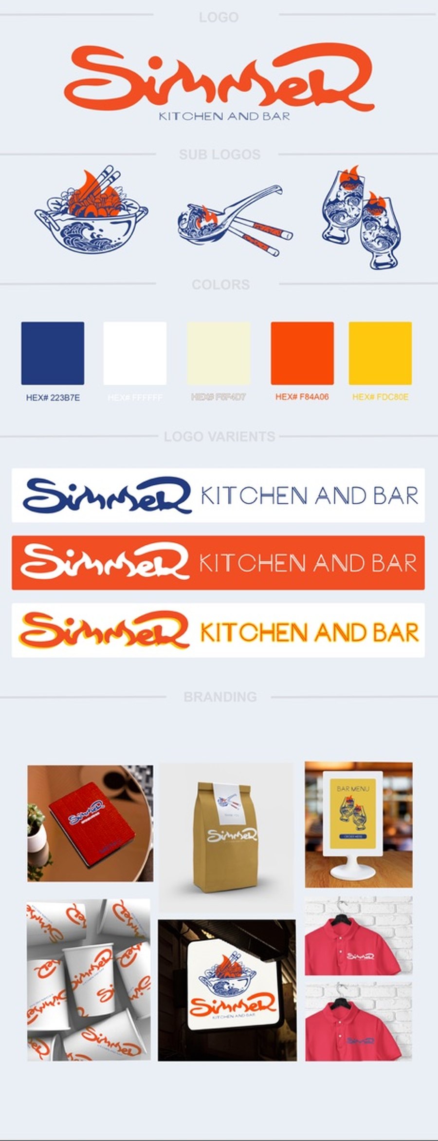
Brand kit · dayFig. 45 · Simmer, open for lunch
The two m's are drawn as flame tongues, so when the hotpot sits above the word the
lockup reads as a pot over a fire rather than two elements stacked. The same flame
carries into the sub-marks, rising out of the noodle bowl and off the spoon, so each
one still says heat when it is lifted on its own. Navy, cream and orange, and the
lockup is given three grounds so it survives a white menu, an orange band and a
kraft bag without being redrawn.
Brand kit · nightFig. 46 · Simmer, open for the club
The same marks rebuilt as neon tube on black, with their own five-colour palette.
Sign mockups on a foliage wall and a painted wall check that the tube reads at
room distance before anyone quotes a fabricator.
E · What it is building now
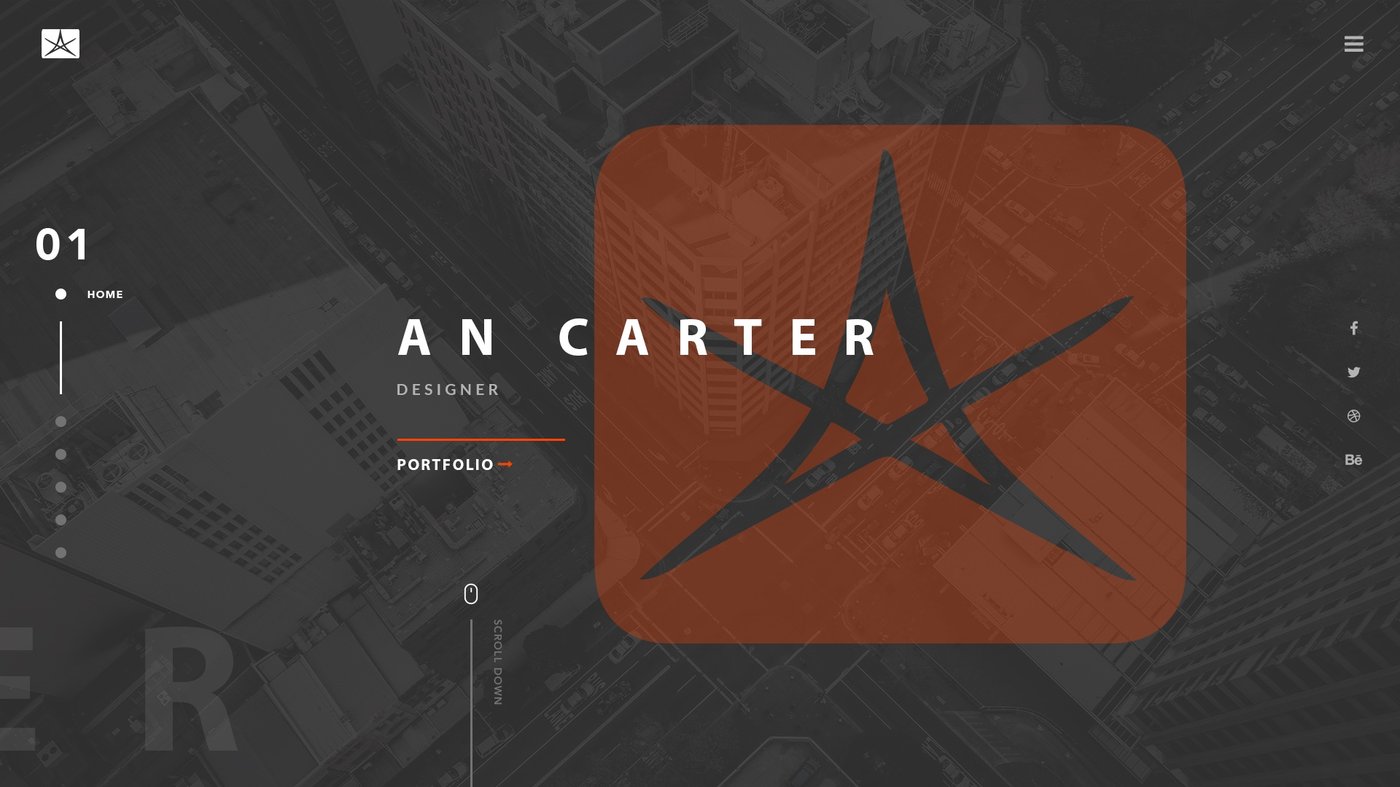
Previous siteFig. 47 · What the drawing pad replaced
A conventional portfolio homepage: full-bleed photograph, mark, name, title, and a
link into the work. It did the job, and it looked like every other designer's.
Replacing it with something a visitor has to touch was a decision, not an accident.
MotionFig. 48 · The homepage is a drawing pad
Canvas, six colours, three brush weights, eraser, undo, clear, an optional name and
a send. The drawing is mailed rather than stored, so the page has a purpose after
the visitor leaves it.
MotionFig. 49 · Neon Alley, walkable
Built in Three.js and running in a browser: lit storefronts along an alley, a minimap,
zoom, and June speaking from the foot of the screen. Each storefront is intended as
its own branded interior, which is identity pushed into spatial and interactive form.
In development.
Colophon
Every figure carries its production status. Artwork is drawn in Adobe Illustrator;
generative tools handle repetitive production work and styled renders. Creative decisions
and final review stay with me.